
Juniper Woodland Primary School
Guide1
Tables, Images and Columns
This short guide provides simple, step-by-step instructions for adding and formatting certain content components using our company’s CMS. Follow these guidelines to ensure your pages are visually appealing and display correctly on any device.
Tables
Creating New Tables:
All new tables should be created using the ‘Styled Table’ Template in ‘Templates’ editor of the CMS.
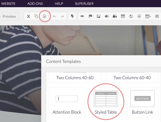
This template automatically creates a fully responsive table that adapts to the device’s screen size.
Editing Existing Tables:
If a table already exists on a page of content, then it is important to set the ‘Width’ of all tables to ‘100%’.
Failing to set ‘Table Width’ to a percentage ‘%’ will result in ‘tables’ running off the screen of desktops and mobile devices.
Make the table responsive:
The Table below has an absolute width setting of 1500px so not all of the contents of the table can be seen without side scrolling.
[Logged into CMS] Right click within the table below and select ‘Table Properties’, then set table ‘Width’ to ‘100%’.
No need to set height when using percentages!.
| Combined (Reading, Writing, Maths) | GPS (Grammar, Punctuation, Spelling) |
Images
Images
Below, we are referring to an “Image,” ie: a photograph or picture over 200px wide (logos and icons are not included).
- Set the Width as a percentage (e.g., 100%) so images scale correctly on any device.
Avoid setting large images to a fixed width (e.g., 700px), as they will appear oversized or stretched on mobile devices.
Columns
Aligning Images:
In the image properties settings. Do not use “Right” or “Left” align to align images; instead, use a 2 Column Template:
- Create a 'Two Column' template.
- Place your text content in one column and place your image in the other column (or visa-vera).
- Set the image width between 70% and 100% and align it to Center.
In mobile view, the 2 Column Template automatically stacks the content, placing 'column 1' text first and the image below in 'column 2', ensuring a clean, full-screen view.
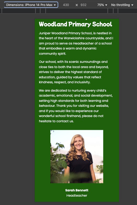
Here's an example of a '2 Column Template’, Text in column 1 and an image in column 2.
Welcome to Juniper Woodland Primary School
Juniper Woodland Primary School, is nestled in the heart of the Warwickshire countryside, and I am proud to serve as Headteacher of a school that embodies a warm and dynamic community spirit.
Our school, with its scenic surroundings and close ties to both the local area and beyond, strives to deliver the highest standard of education, guided by values that reflect kindness, respect, and inclusivity.
We are dedicated to nurturing every child’s academic, emotional, and social development, setting high standards for both learning and behaviour. Thank you for visiting our website, and if you would like to experience our wonderful school firsthand, please do not hesitate to contact us.

Sarah Bennett
Headteacher
See the information below to view this Webpage in Mobile View. You will see how the 2 Column Template above breaks down to a mobile device view.
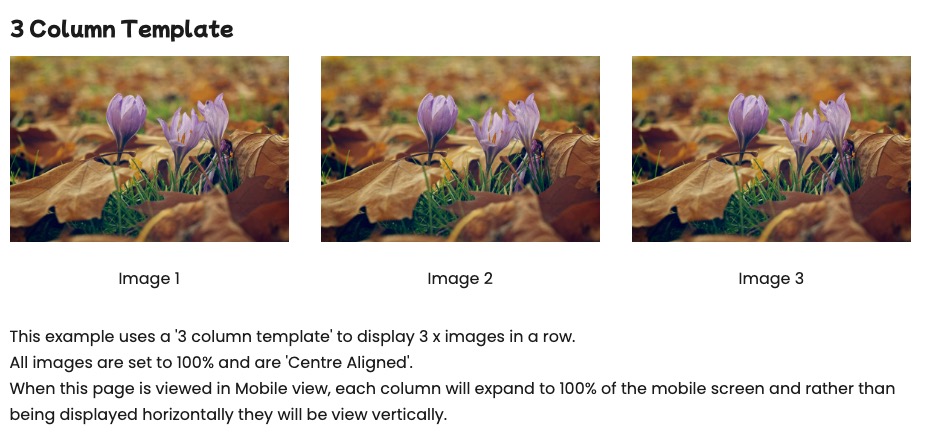
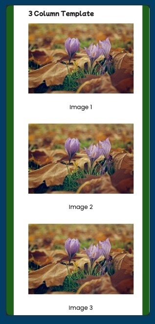
3 Column Template

Image 1
Image 2
Image 3
This example uses a '3 column template' to display 3 x images in a row.
All images are set to 100% and are 'Centre Aligned' and all image title text is normal text that is centre aligned (Not using 'Captions').
When this page is viewed in Mobile view, each column will expand to 100% of the mobile screen and rather than being displayed horizontally they will be view vertically.
Example:
Desktop
Mobile
Logos or Icons (eg:Small Images)
- For logos and icons you can use fixed pixel dimensions (for example, 150px width - no need to set 'height') rather than percentages.
Example:
Desktop & Mobile example
View Website in Mobile View
To check any website in Desktop or Mobile view:
This example is using Chrome Browser but most browsers have similar features.
Right click on the development website (Logged out) and from the pop up menu, select ‘Inspect’
From the inspection window that appears, click the ‘Toggle device toolbar icon’
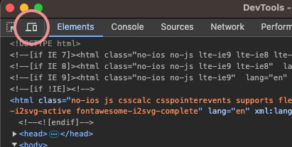
Once the icon is clicked you’ll see that the webpage has changed to ‘Mobile’ view.
At the top of the mobile-view web page you have various options to change view settings, such as: ‘Device (Apple iPhone, iPad, Samsung Galaxy etc..) and zoom’.
Click the Toggle device toolbar icon’ again to get back to ‘desktop-view’.
By adhering to these best practices, you’ll ensure that all website pages look professional, are user-friendly, and are responsive across all devices. If you have any questions or need further assistance, please contact the Production Team.


